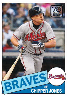
Most of these are from 2021 Topps. A couple are 2020 Topps parallels.
A new Hammer and there will be another.
Last but not least is my third Brave from the Through the Years insert set. I posted the Hank last week.
Now for the complaint. No, not about Topps (although that would be an easy task). No, this is about Panini. I laid word gently about this in my 2021 Donruss post. I did get my complete set in on Saturday. I even have the Chicken on it's way too. Now just need the Ayala SP.
I had mentioned that the "variations" (there are 38 total) had 3 back of the card variations. I will let you figure out the gripe.
It is the spacing on the 61 after Miami. STUPID!
 |
Okay on Yelich, it too is the text spacing.
Basically the same spot, but not quite as "off" as the previous example. STUPID!
Here is the third example. The babe must be rolling over in his grave. Seriously the variation is that the reverse printing of the card back. UGH! Anyways.
I'll finish up the Deal 2 cards tomorrow.
Later


Were those variations done on purpose? If so, there has to be a back story I'm missing. Like a famous error card with spacing issues. Even if there is a cool back story, this is a silly variation.
ReplyDeleteYes, intentional variations. Silly is too kind of a word.
DeleteUgh. 80s/90s Donruss is notorious for these kinds of back variations (TCDB is a disaster) but I think even the people who collect and obsess about them and hate them.
ReplyDeleteSpacing? Really? Good thing I stay away from Panini baseball as much as possible.
ReplyDeleteAs for the Ruth, maybe Panini is honoring 2020 Topps Update!