We had another back to back'er last night. RJ again.
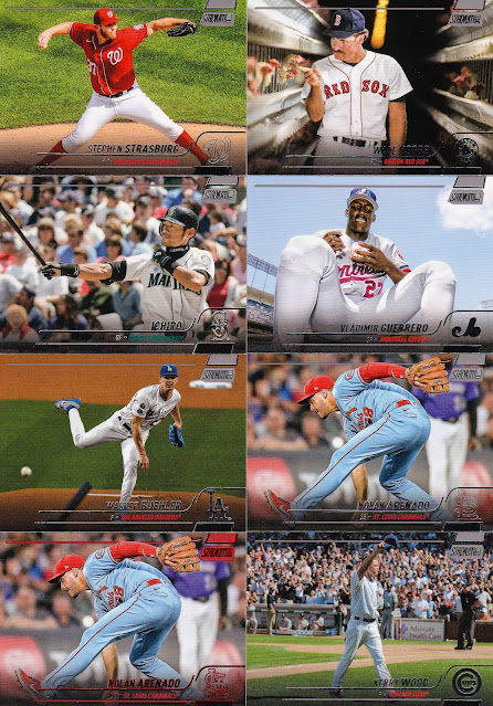
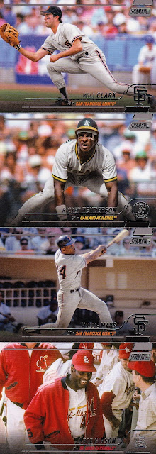
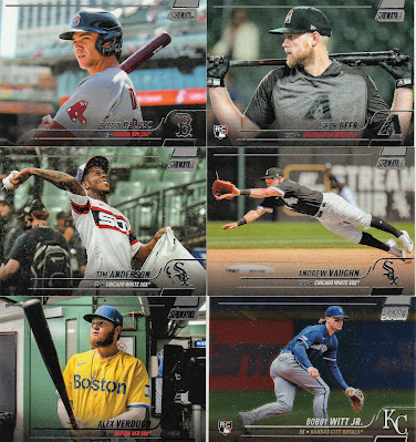
Now for the TSC review: the groundwork is that I will not be showing the base cards that I got as I will do that one day once I complete the set. No time in the immediate future for sure. I will however show the inserts, parallels, and the dupes that are keepers (PC and future PC guys). In my opinion I'd love to show what I got as the photos are what we all expect from Stadium Club, but you'll have just see the dupes and you will get it. The card quality or card stock is worse than last year which was a disappointment to me. It was better in years past. I agree with the Owl that they are Upper Deck ish in appearance/design. 09' 10' ish, but the the shots are overall pretty good some great.
The Master Photos are just so hard to store. I really wish that Topps would forget them. As you see I got a couple of dupes and 1 non keeper Bichette which was damaged in the box.
This one is okay I can live with it or without.
Now for the PC guys.
The chrome Cutch is a parallel as it is totally different from the other chrome cards I pulled. The Harper is the orange parallel.
All in all the great photos offset the poor choices in inserts. With that said some of the photos above could be "variations" there are tons of them. I mean alot which I do not like. The time it takes to look up each variation and compare it to each card is not something I have time for right now.
Hopefully you got a good perspective at this year's set.


My favorites are the Boggs and Strawberry. I must be living in the past. Especially the Boggs is one I need to get a copy of. Thanks for sharing!
ReplyDeletehold off on getting the boggs, i've got a couple of extras
DeleteSo many great photos - Rizzo, Mattingly, Strawberry, Ruth, Henderson, Mays, Gibson. Great card of Rivera with the New York Post - I might have had that paper, but I don't anymore. Would not have been exactly the same one anyway.
ReplyDeleteThere is nothing about those inserts that feels like "Stadium Club" at all.
I've always enjoyed the photos...still partial to the debut release, though.
ReplyDeleteSome nice cards. No Twins? Wow, I got a double up! Thanks. Merry Christmas and Happy Holidays.
ReplyDeleteEnjoy seeing the photos as I haven't seen much of this so far.
ReplyDeleteStadium Club's inserts and parallels have never done it for me, wouldn't miss them if they disappeared, but they won't.
Really hate the Masterphoto mini size. Sort of ruins the concept of the originals (not that the overtrim exists anymore due to (supposedly) better printing tolerances (though my Logan Webb is a 70s-level mistrim)). You're also 100% correct about the inserts being forgettable. I stopped ripping Stadium Club years ago because every insert felt like a wasted card.
ReplyDeleteFor as nice as the base card images are, the inserts sure are blah. This almost seems like a product that might actually be better if it were to come out sans inserts.
ReplyDeleteAnd I really like that Ruth and Gehrig card. I don't seek out new cards very often, but I think I might have to do so for that one.
Not exactly a ground breaking set, but it's nice.
ReplyDeleteI'm not sure why, but I really like the Will Clark.
Thanks for showing off the cards! And Merry Christmas to you and all!
ReplyDeleteNot a very flattering photo of Blake Snell. I barely recognized him at first glance. On the other hand... that Rickey is fantastic.
ReplyDeleteP.S. I'm a sucker for oversized cards. I was just flipping through my stack of 90's Master Photos during the Thanksgiving break.
Merry Christmas!
ReplyDeleteInstead of the Boggs' chicken picture, I think they should do a photo of the beer drinking challenge that It's Always Sunny in Philadelphia crew made famous!
ReplyDelete